
I was sitting in a glass-walled conference room five years ago, watching a junior operations manager spend forty-five minutes meticulously assigning neon hues to a digital project board. He wasn’t actually moving the needle on the logistics bottleneck; he was just playing with a digital palette. We’ve fallen into this trap of thinking that complex color coding systems equal better organization, but usually, it’s just performative productivity. When your system requires a legend just to understand your own calendar, you haven’t built a workflow—you’ve built a distraction.
I’m not here to sell you on a new aesthetic or a complicated app that requires a tutorial to master. My goal is to show you how to use color as a high-speed visual shorthand to reduce your mental load. I’ll share the stripped-back, functional frameworks I use to audit workflows and keep my own head above water. We are going to move past the decoration and focus on using color to reclaim your focus, ensuring your tools actually serve your work instead of becoming more work themselves.
Table of Contents
- Mastering Visual Management Systems Without the Digital Clutter
- Leveraging Color Psychology in Organization to Protect Your Energy
- Five Ways to Use Color Without Losing Your Mind
- Cutting Through the Noise: My Final Rules for Color Coding
- The Philosophy of Visual Clarity
- Stop Decorating and Start Organizing
- Frequently Asked Questions
Mastering Visual Management Systems Without the Digital Clutter
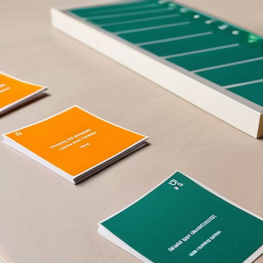
The biggest mistake I see people make is treating their setup like a digital museum—beautiful, but completely non-functional. They spend hours tweaking hex codes and downloading specialized software, thinking they’re building a masterpiece. In reality, they’re just creating more work. True visual management systems aren’t about aesthetics; they are about reducing the time it takes for your brain to process information. When I look at a project board or a calendar, I shouldn’t have to read to understand the status. I should be able to sense it instantly through a glance.
To get this right, you need to strip away the complexity. Instead of complex chromatic categorization methods that require a manual to understand, pick three to five core colors that represent your primary work streams. For example, use one specific shade for deep work and another for administrative tasks. This approach to color-coded scheduling techniques works because it taps into your brain’s natural ability to recognize patterns without taxing your cognitive load. Keep it simple, keep it consistent, and stop over-engineering your workflow just for the sake of looking organized.
Leveraging Color Psychology in Organization to Protect Your Energy

Most people treat color as a purely aesthetic choice, but if you want to actually protect your cognitive bandwidth, you need to treat it as a psychological tool. We aren’t just sorting tasks; we are signaling to our brains how to feel about them. When I’m designing a workflow, I look at color psychology in organization to prevent decision fatigue. If your entire calendar is a sea of aggressive red, you’re going to spend your day in a state of low-grade fight-or-flight. Instead, use muted blues or greens for deep-work blocks to signal stability, and reserve high-contrast tones only for the absolute non-negotiables that require immediate attention.
The goal isn’t to make your workspace look like a rainbow; it’s to create a subconscious shorthand. By implementing specific chromatic categorization methods, you stop “reading” your to-do list and start sensing your day. This allows you to gauge your upcoming energy requirements at a glance. If you see a heavy block of high-intensity colors, you know you need to schedule more recovery time afterward. It’s about using visual cues to manage your internal state, not just your external checklist.
Five Ways to Use Color Without Losing Your Mind
- Pick a palette and stick to it. The biggest mistake I see is people creating a new “system” every time they download a new app. Choose three to five core colors for your primary categories—work, personal, urgent, low-priority—and refuse to deviate. Consistency is what builds the mental shortcut; complexity is just noise.
- Limit your visual field. If every single line on your calendar is a different neon hue, you haven’t organized anything—you’ve just created a digital migraine. Use color to highlight the outliers and the essentials, not to paint the entire canvas. If everything is bright, nothing is important.
- Use color for “state of being,” not just “task type.” I like to reserve one specific, calming color—maybe a soft sage or a muted blue—to represent deep work blocks or recovery time. It’s a visual signal to your brain that it’s time to stop reacting and start focusing.
- Audit your system every quarter. Just like I’d strip down an old teak chair to see what’s actually holding it together, you need to look at your color system and ask if it’s still serving you. If you find yourself ignoring a specific color, it means that category has lost its meaning. Kill it or change it.
- Keep the physical and digital in sync. If your digital calendar uses red for “high priority,” your physical planner or your desk’s task board should follow suit. When your environment speaks the same visual language, your brain doesn’t have to work twice as hard to translate your schedule.
Cutting Through the Noise: My Final Rules for Color Coding
Stop treating color like a decoration; use it as a functional signal to tell your brain exactly what requires attention and what can wait.
Keep your palette lean—if you have twenty different colors, you don’t have a system, you have a mess that’s adding to your mental load.
Prioritize the “why” over the “how” by ensuring every color choice serves a specific workflow purpose rather than just looking pretty on a screen.
The Philosophy of Visual Clarity
Color coding isn’t about making your calendar look pretty; it’s about building a visual shorthand that tells your brain exactly where to spend its energy before you even read a single word.
Emmett Kowalski
Stop Decorating and Start Organizing

At the end of the day, color coding isn’t about making your planner look pretty or creating a rainbow of digital folders that you’ll never actually open. It’s about building a visual shorthand that allows your brain to stop processing and start performing. We’ve looked at how to implement these systems without drowning in app notifications and how to use color psychology to guard your focus rather than draining your battery. If you can categorize your high-priority tasks, your administrative noise, and your personal time into distinct, intuitive visual buckets, you aren’t just organizing a calendar—you are reducing the cognitive load required to navigate your own life.
Don’t let the pursuit of the “perfect” system become another item on your to-do list. You don’t need a complex software suite to make this work; a simple set of high-quality pens or a few basic tags will do the job just fine. The goal is to create a workflow that feels quiet, predictable, and intentional. Use these colors to carve out the space you need to do your best work and, more importantly, to reclaim your time for the things that don’t require a color-coded system at all. Build a system that serves you, then get back to the work that actually matters.
Frequently Asked Questions
How do I keep a color-coding system from becoming just another layer of digital clutter that I end up ignoring?
The trap is thinking more colors equals more clarity. It doesn’t; it just adds more decisions to your plate. To keep it from becoming noise, limit yourself to three to five core categories—nothing more. If you have a color for every single niche task, you’ll stop looking at them entirely. Use color for high-level scanning only. If a color doesn’t trigger an immediate, actionable realization, strip it out. Keep it lean.
Is there a way to implement this without spending hours setting up complex rules that eat into my actual work time?
Look, if you spend your whole Monday setting up a complex color-coding architecture, you haven’t built a system—you’ve built a hobby. That’s just productive procrastination.
How do I transition my existing, messy workflows into a color-coded system without feeling completely overwhelmed?
Don’t try to overhaul everything overnight; that’s how systems go to die. Start with your biggest pain point—usually your calendar or your primary task list. Pick three core categories, assign them colors, and stick to them for a week. Once those feel intuitive, layer in the next set. It’s about incremental stability, not a total digital renovation. Build the habit first, then refine the aesthetics. Keep it simple so it actually sticks.
